The Orthochromatic Film Simulation, Straight Out of the Early Film Era
- Veres Deni Alex
- Sep 24, 2025
- 3 min read

Updated: Sep 26, 2025
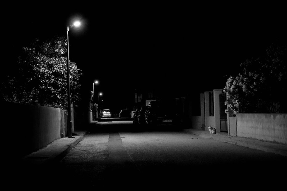
Orthochromatic is a film simulation that stands out for its high-contrast, slightly surreal look. It handles reds and skin tones differently: reds come out darker, blues and greens pop. And this is what gives landscapes, street shots, and even portraits their eerie, raw, and gritty look that also characterized orthographic film stocks.

History of Orthochromatic Film
Orthochromatic film was invented in the 1880s by Hermann Vogel and quickly became the gold standard. Before that, film could only capture blue light—basically wavelengths up to about 400 nm—so greens and yellows weren’t recorded at all.
What changed things were sensitizing dyes added to the emulsion. These dyes absorbed light from green and yellow wavelengths and transferred that energy to the silver halides, making the film “see” more of the spectrum. Suddenly, greens, yellows, and even some oranges showed up on film.
But it still couldn’t register reds, which is what gives orthochromatic film its distinct look. Anything red shows up much darker than expected. Skies and foliage, on the other hand, often came out overexposed. The result is a punchy, contrasty look, that makes any image stand out.
This remained the standard until the 1920s, when panchromatic film arrived. By extending sensitivity into the red range, it produced images closer to how our eyes actually see, so it quickly became the everyday choice, and it still is today.
Why Orthochromatic Film Isn't As Popular Today
Most photographers lean toward panchromatic film because it’s versatile, easier to use, and more true to life. Since it captures the full visible spectrum, exposures look natural and balanced. It also comes in a wider range of speeds (ISO), which makes it more practical in different lighting conditions.
Orthochromatic, by comparison, is usually very slow. Trying to push it to higher ISO makes no sense - the images turn out overly grainy, harsh, and basically unusable.
Back in the day, that limitation meant you were stuck with bright daylight, or you needed a lot of artificial light to make it work. In fact, this is why silent film productions blasted their sets with massive studio lamps: ortho stock simply wasn’t fast enough to handle low light.

Even though it’s not widely used anymore, orthochromatic film still has its place.
It stands out with its high contrast and deep tones, which can give landscapes or street shots a slightly surreal edge. Portraits are trickier, since skin reflects a lot of red light that ortho just can’t register—so faces often come out darker and more contrasty than we’re used to. That said, if you’re okay with a moodier, unconventional look, it can absolutely work for portraits too. I loved using the simulation during our trip to Mallorca, even for portraits.
A good example outside still photography is the movie The Lighthouse. It wasn’t shot on ortho (but on Double X), but the cinematographers mimicked its look with a custom cyan filter.
The result was harsh skies, deep blacks, and pale, ghostly skin tones. It also exaggerated imperfections like wrinkles, tired eyes, and rough skin, which suited the weathered characters. The choice tied directly to the film’s 1890 setting, a time when orthochromatic stock was actually in use, while also amping up the eerie and claustrophobic mood of the story.

Why Sony Makes Orthochromatic Easier to Pull Off
So I’d say there’s definitely a place for this look, especially when you want something a bit moodier, raw, or atmospheric. Luckily, it’s pretty easy to get close to orthochromatic on a Sony camera, thanks to the flexibility of the Picture Profile menu. Sony lets you tweak the depth of individual color channels so you can finely adjust the depth or brightness of each color. This feature is what allowed me to easily deepen reds, brighten blue, and push contrast where I wanted it.
This makes it easier to recreate the signature ortho punch—deep shadows, bright skies, and skin tones that feel a little otherworldly—without needing actual film. Fuji simulations are great, but they don’t offer that kind of fine-tuned color control, which is why Sony is quite a versatile option for anyone experimenting with custom film-inspired looks.

Just like real orthochromatic film, this film simulation will make your skin tones quite dark. So when using this particular recipe, you’ll need to overexpose the scene by +0.5 to +1 stop, unless you want your skin tones to come out very dark and unpleasant. This overexposure will also blow out some highlights, which adds to the typical look you'd get with real orthochromatic film.
It’s an interesting look with a cinematic quality, but it takes a bit of experimenting to get good portrait results. That being said, it’s not the best black-and-white simulation for portraits, especially if the subject has strong red skin tones. This is more of an experimental recipe, best used for creative or stylized shots rather than everyday portraits.
You can explore this and all my film simulations through the link below


Comments