How to Set White Balance for Sony Film Simulations


RAW files give you maximum flexibility when editing color later. But if you want a finished, “baked-in” look straight out of the camera, you need an unconventional approach, especially in how you set white balance.
The usual flow is to use a gray card to balance the light source or rely on AWB when shooting and achieve “perfect” neutrality. That’s usually fine, since normally we adjust colors in the edit phase to give our photos or videos the look we want, or we aim for a neutral, accurate white balance.
But when your goal is to convey a mood or story through color, perfect white balance is a trap. In fact, using Auto White Balance (AWB) or a gray card will actually fight against the warm tones that define a Kodak Gold recipe, for instance, or the cool cyan of a Cinestill film simulation.
That’s why most of my recipes rely on fixed Kelvin and Color Filter settings. Since we’re limited by the camera’s lack of complex tools like Hue Sliders and Color Wheels, we have to get creative. By 'pushing and pulling' the Kelvin and Color Filters, we can trick the sensor into shifting colors, achieving a specific look that I’d normally need a RAW editor to pull off.
In this article, I’ll show you how to set white balance to adapt any Sony film simulation when the light changes, so you can preserve the look across different environments.
👉 Since these recipes are primarily designed around a Daylight balance, they work best in natural light and rarely need adjustment outdoors. You’ll only really need to tweak things if the lighting becomes extreme, like the heavy cast of Blue Hour or the aggressive reds of a late sunset. For daytime interiors, a light touch is usually plenty: try dropping your Kelvin by 200–300K or nudging the color filter about 0.5 - 0.75 towards Blue.
Adjustments really only become a "must" when you move into mixed artificial lighting, where every light bulb carries a unique tint that no single preset can perfectly predict.
What Is White Balance?
White balance is a tool used to neutralize color casts, helping you get colors that look natural and balanced in almost any lighting situation.
The reason it matters is that different light sources emit different colors of light. Sunlight at noon is relatively neutral. Tungsten bulbs push orange. Fluorescent tubes push green. Shade and overcast skies push blue. Your eyes adapt to these shifts automatically and barely notice them. Your camera doesn't — it records whatever the sensor sees, color cast and all.
Setting white balance correctly means the camera compensates for the light source's color, so a white shirt looks white rather than orange or blue. But "correctly" is relative. When you're using film simulations, you're not always aiming for neutral - you're aiming for a specific look.
Kelvin and Color Filter Settings
To keep it simple: Kelvin and the Color Filter are the two tools you use to control the "color" of your light.
Kelvin (K): This is your broad adjustment for Temperature. *Simplified explanation* lower numbers (2500K–4000K) cool the image down by adding blue, while higher numbers (6000K–10000K) warm it up by adding amber into the image.
Color Filter: This is for fine-tuning. The B–A (Blue–Amber) axis acts as a secondary temperature control, while the G–M (Green–Magenta) axis handles color Tint.
In short: Use Kelvin to get the general warmth right, then use the Color Filter to "nudge" the colors until they perfectly match the film look you're aiming for. If the skin looks too green, move toward Magenta; if the scene feels too "digital" and cold, move toward Amber.

Why adjust for different lighting?
You don’t have to adjust, only if you want total consistency or if the colors feel "off."
With real film, you’d typically shoot an entire roll of daylight-balanced film regardless of the light source, perhaps only using a physical lens filter to adapt to tungsten light. Otherwise, you’d just let the film react naturally to the environment.
This means the White Balance would not be perfect every time, and why would you want it to be?
After all, the beauty of everyday light is that each part of the day has its own character. Digital gives us the advantage of calibrating on the spot. If you want that perfect "calibrated" shot, you can adjust, or, you can leave it as it is.
But adjusting Kelvin can help you get the same kind of colors as daytime even in more challenging light.


Kodak Gold during Blue Hour vs Kodak Gold adjusted
Why Not Rely On Auto-White Balance (AWB)?
AWB constantly adapts to the environment, you will get totally different results from one second to the next as the camera analyzes the colors present in the scene and makes minor or major adjustments in the settings. That’s why the simulations are based on custom white balance settings.


Cuban negative on AWB 1 second apart as the camera reads different Kelvin values
The Myth of "Perfect" White Balance
We break perfect white balance to infuse emotion and create a story through color. The sickly green of Se7en, the intimate, melancholic reds of Her, the nostalgic, dollhouse-like pinks of The Grand Hotel Budapest, none of those are "correct." They're intentional.


A couple shots from "Se7en" with the white balance completely off
The same applies to analog film. Kodak Portra 400's peachy-magenta tint on white shirts, or CineStill 800T's cyan shadows, those imperfect color shifts are precisely what makes these film stocks iconic, and also the reason why we reach for film simulations to begin with. It’s also the reason why some find digital colors clinical or soulless.
Accurate white balance is just a tool, not a rule, and it won't always do you right. Color neutrality isn't a standard for beauty, nor is it advisable in every situation; it’s simply a technical starting point. If you "correct" a sunset until the whites are neutral, you’ll kill the soul of the image, leaving it cold, clinical, and ghostly.
So when should you not adjust? When the cast is the look. A tungsten-orange kitchen. A blue-hour cityscape. A neon-lit alley. Adjust when the colors feel wrong to your eye, not because the Kelvin number doesn't match the light source.


Kodak Gold at sunset vs Kodak Gold set with perfect White balance
There is a huge difference between the two, and both give totally different vibes.
Why We Love This
Some color grades leave a permanent mark on our memory, while others simply fade away. We aren’t drawn to film and iconic color palettes because they are "accurate". We love them because they are evocative.
We love film and iconic color grades specifically because they aren't accurate to real life, but pleasing and inspiring. A white shirt with Kodak's Portra 400 warm peachy-magenta tint, or maybe the cold cyan cast of Cinestill 800T is exactly what gives an image character. We intentionally push colors into "unnatural" territory to achieve a specific look, and convey a mood.
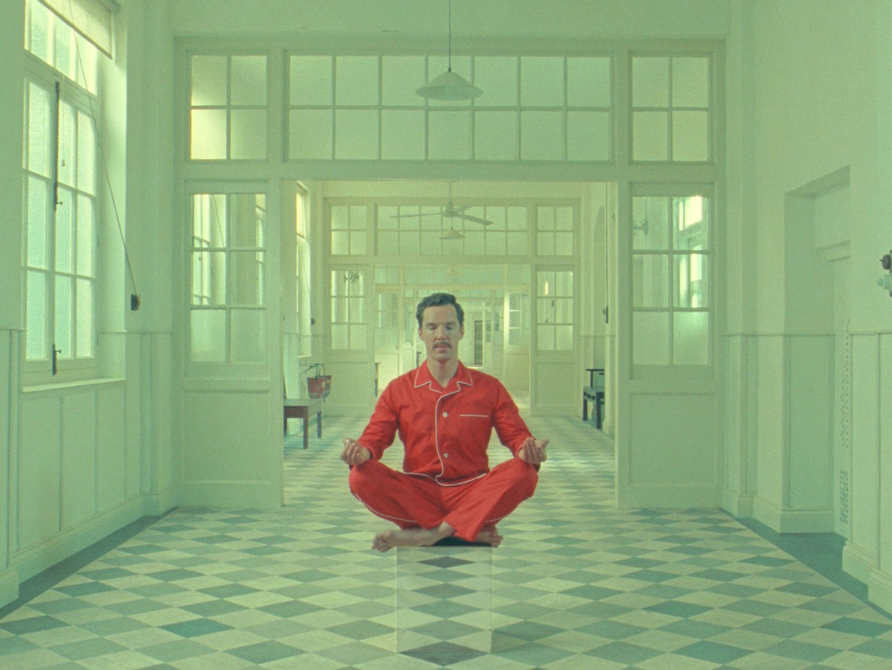


A couple stills from movies which choose to break white balance completely
Isn't that why we find digital so boring, because in fact, it’s too accurate? Isn’t that why we want to use film simulations on our digitals cameras? White balance is a technique to convey your vision, not a law to follow.
Here is an example why calibrating for perfect white balance can take out the magic from a shot:

Frontier scans introduce strong color shifts along with blue shadows and saturated amber skin tones, which make Portra what it is. Once we white balance it, fix the color shifts, it becomes true to life but it also loses its character.
In reality her skin tone is not nearly as saturated, nor as orange-amber. Greens are not blue and de-saturated, and the asphalt definitely isn't painted blue like in the frontier scan. Basically every color is shifter unnaturally. But do I love it? Yes!
The Trap of Perfect White Balance
Every time you shift your camera just a few centimeters, your light readings change. We are constantly bombarded with reflected color from every direction. Our eyes are always trying to neutralize these shifts, similar to a camera’s Auto White Balance (AWB), and that only proves that color is subjective, and calibrating for perfect white balance won't necessarily give the most neutral, natural or pleasing colors.
How To Set White Balance For Every Light Source
The film simulations rely on intentional color casts, but a shifting light source can push those colors in a way that totally departs from the original look.
That’s where offsets come in. Think of them as small adjustments added on top of your base settings. Your base recipe assumes daylight (around 5500K), and the offsets simply tweak it for different lighting, so the look stays consistent across different environments.
The goal isn't to reach a perfect neutral, but to ensure the recipe feels the same whether you're shooting under the sun or a light bulb.
(Values represent the shift needed relative to the base Daylight recipe)
Artificial Lighting
Incandescent (Home Bulbs): These vary from warm to deep orange.
Adjustment: Drop −1000K to −2500K or shift −2B to −6B.
Tungsten (Studio/Stage): Strong, consistent orange.
Adjustment: Drop −2000K or shift −4B.
Fluorescent (Offices/Malls): Known for a "sickly" green/cool cast.
Adjustment: Warm the image by +500K to +1000K (or +2A) and add +1M to +2M (Magenta) to neutralize the green.
Natural Light & Weather
Indoor Natural Light: You'll often notice colors come out slightly warmer than direct sun.
Adjustment: A minor drop of −300K or −1B is usually sufficient.
Overcast / Cloudy: Clouds act as a giant blue filter, making images look colder and "muddy."
Adjustment: Counter with +500K to +1000K or shift +2A.
The Golden & Red Hours
Golden Hour: Usually this doesn't require adjusting. However, if it’s overwhelming:
Adjustment: Decrease by −300K to −1000K or shift −2B.
The Red Hour: Just before sunset, skin tones can look "burnt" or oversaturated.
Adjustment: Drop -1000K −2000K or shift −2B to −4B to preserve natural skin tones.
What To Do When You've Maxed Out the Kelvin Range - The 2-Point Rule
If you've pushed Kelvin as far as it goes and the image still feels off, switch to the Color Filter's Blue–Amber axis.
💡 Rule of Thumb: A shift of 2 points on the Blue/Amber filter is roughly equivalent to 1000K in color temperature. While they affect color rendering slightly differently, this is your "emergency brake" for balancing extreme lighting conditions.
A Practical Example: Incandescent Light
If a recipe calls for 7500K | B2:M1, you can adapt it for incandescent light using one of two methods:
Adjust Kelvin: Change to 5500K | B2-M1
Adjust Color Filter: Change to 7500K | B6-M1
Both methods work similarly to balance out the color cast of incandescent light.
Pro Tip: I usually adjust Kelvin first for big changes (like moving from sun to shade) and use the Color Filter for 'flavor' or fixing a weird neon sign tint. Once the Kelvin is set, fine-tune the Green/Magenta axis of the color filter to neutralize any strong tint casts from the light source.
Of course, some lighting is easier to balance than others. In certain scenarios, achieving perfect color consistency is challenging or even impossible. Sometimes we just have to embrace the unique character of the light we're given or use film simulations that work in any condition.
Usually low saturation film simulations with AWB work great in all conditions.
Calibrating for the Night: The Sodium Vapor Challenge
Nighttime photography can be a color-grading nightmare, due to sodium vapor lighting - an intense, narrow-spectrum yellow that drowns out every other color in the frame.
If you try to balance it out completely, you’ll likely lose all colors, leaving the image feeling dead and fake. Truth is, no white balance adjustment fully fixes it and all film simulations will look similar under it. Either yellow-green or orange-red casted. It is simply like a scene with only one light, which is yellow. There is no other color to work with.
So what’s the solution? In strong color lights like Sodium Vapour, you have two choices: counter the warmth with a cool recipe like CineStill 800T, or embrace the warmth with a look that highlights super warm tones.
I have created specific nighttime simulations designed for this, which look great under sodium vapour though they're 'ugly' in broad daylight - Cinestill 800, Vespera, Veniliqum, and Gold Luxe come to mind.
In most cases, low saturation recipes set on AWB will work great under sodium vapour and daylight conditions.
An Alternative To Custom Kelvin Film Simulations
While my Picture Profile film simulations rely on fixed white balance and specific color filters (my personal preferred method for consistency), I know many of you value the flexibility of Auto White Balance (AWB).
To bridge that gap, I’ve included AWB-based recipes in the Picture Profile Simulation pack, but also developed 39 Creative Look recipes which are mostly based on AWB, so they are easier to use.
I created these recipes so we can spend less time post-processing and more time enjoying the act of taking photos. It doesn’t matter if you’re a pro or hobbyist. The goal is the same: beautiful, film-like colors straight out of camera.
Note on White Balance Priority: For the most consistent results with these recipes, I recommend setting your AWB Priority to 'Standard' or 'White'. If you use 'Ambience Priority,' the camera may fight against the recipe's intended tones by keeping too much of the warm or cool ambient light.
Please note: These require the 'Creative Look' menu found in newer Sony models and are not compatible with older 'Creative Style' cameras.
Key Takeaway?
My best tip is to trust your eyes and calibrate as you go. If a shot looks too cold, push the warmth up. If it looks too green, adjust the color filter. I typically use recipes exactly as they are, but if I notice skin tones look a bit off or the vibe isn't quite right, I’ll jump in for a quick five-second adjustment and keep moving.
Let me know in the comments what you'd like to see next! I can't wait to see your shots on the official subreddit.

Comments