FujiFilm vs Sony Film Simulations | Stop Sacrificing Color
- Veres Deni Alex
- May 10, 2023
- 10 min read
Updated: Jan 8, 2025
If you’re a fan of Fujifilm’s film simulations, you might be wondering if you can achieve the same look on your Sony camera. After all, Fujifilm is known for its amazing colors and classic film emulations, while Sony colors are often criticized. So, if you’ve ever wondered how Sony Film Simulation recipes compare to Fuji Film Simulations, this is the post for you. Welcome to the showdown: Fujifilm vs Sony. 🏁
The good news is that you can actually get very close to Fujifilm’s film simulations on your Sony camera using only the in-camera Picture Profile settings, Kelvin and Color Filter adjustments. No need for any external presets, LUTs, or post-processing.

In this article, I’ll show you how to match your Sony camera with your Fuji camera using the Sony RX100 VI and the Fujifilm X-S10 as examples. I’ll compare the film simulations of both cameras side by side.
This article is focused on Fujifilm vs Sony color film simulations.
Thinking of switching from Sony to Fuji? Read this first.
Let's get started!
Table of Contents
Fujifilm vs Sony Film Simulations
Let's dive into the comparison of Sony and Fujifilm Film Simulations. Sony's Picture Profiles control things like contrast, shadows, color mode, global hue, saturation, and detail sharpness. They are very powerful in matching other camera looks but to really match Fuji's colors perfectly, you need the temperature and color filter settings. They do the heavy lifting of shifting and balancing the final colors. This is very important. Here's a little snippet of what the color filter settings can do:
Sony Classic Chrome vs Fuji Classic Chrome
Sony custom Picture Profile + in camera color filter settings to match the Fuji
Shot on RX100 VI vs Fuji X-S10


Can you tell one from another? As you can see it comes very close, almost seamless of course with some differences, and that is without any post-color grading and matching. Straight out of camera. This is when using Sony Picture profiles + in camera Kelvin and Color Filter adjustments. You need all 3 elements to create the magic.
But one of the most asked questions is 'Can I use AWB with my film simulations?'
If you want the absolute best results straight out of camera, AWB (auto white balance) is not your friend.
And I'll show you why.
Let's compare the Fujifilm vs Sony film simulations.
Updated film simulation comparison:
Fujifilm X-T5 vs Sony a6700
Provia - Sony vs Fujifilm

Velvia - Sony vs Fuji

Astia Film Simulation - Sony vs Fuji

Classic Chrome Film Simulation - Sony vs Fujifilm

Pro Neg Std. - Sony vs Fuji

Classic Neg Film Simulation - Sony vs Fujifilm

Unfortunately, the Classic neg cannot be recreated in a Sony camera, so I thought of giving the Sony recipe a little twist. Something that will set Sony apart. You can check out more samples of Sony CLassic Negative here.
Nostalgic Neg - Sony vs Fuji

Again, Classic Negative and Nostalgic Neg have quite strong color shifts, and its harder to recreate in a Sony camera without individual Hue Saturation tools. That being said, I created a Sony version of the Nostalgic Neg and it comes pretty close with a couple differences. Fujifilm will have stronger blue tinted shadows compared to the Sony and the reds are shifted towards orange, which will be the biggest difference between them.
Eterna Cinema Film Simulation - Sony vs Fujifilm

You can see how closely they come and that is all straight out of camera without any editing. Of course there will eb some differences when comparing side by side, but the main point is to get pleasing colors straight out of camera without spending time editing.
The main differences between Sony and Fuji lie in the yellows. Fuji's color science desaturates yellows and greens to give a nostalgic feeling, while Sony has a natural approach on color.
How to Use Custom Kelvin & Color Filter Adjustments to Match Fujifilm Colors
To achieve the best color match on your Sony camera, you should utilize the Kelvin and Color Filter settings alongside the Picture Profile menu in order to shift and remap your colors. While the Picture Profile offers powerful options for adjusting contrast, saturation, and other parameters, combining it with in-camera temperature and color adjustments can help you get even closer to Fujifilm's color palette. In-camera we have very limited tools compared to editing software, so we need to take advantage of everything we have on hands.
If you're looking to enhance Sony's colors and mimic Fujifilm's look, it's essential to use the Picture Profile settings in conjunction with Kelvin and Color Filter adjustments. This combination allows for a more refined approach to color matching, making it easier to achieve the desired results straight from your camera.
By carefully adjusting these settings, you can significantly improve how your images look, bringing them closer to the rich, vibrant colors often associated with Fujifilm film simulations.
Check this out ⬇️
Sony Standard Look with Auto White Balance -> Sony Classic Chrome Film Simulation AWB -> Sony Classic Chrome with in camera Custom Color Adjustments
Shot on RX100 VI


Some people ask me, 'Can I use the Film simulation with AWB?'
Short answer: 'You can, but do you want to get the best results straight out of camera?'
I've used these images to showcase the difference it makes by using only Sony's Picture Profiles with AWB, compared to using Picture Profiles in combination with the dedicated Temperature & color filter settings. It's clear to the eye the huge role the Temperature and Color filter play in sifting the colors.
If you only use the Picture Profiles, without the in-camera color adjustments, your color differences will come close to this:
Sony Classic Chrome (without Color settings) vs Fujifilm Classic Chrome

While using both the Picture Profiles + Color adjustments you'll be as close as you can get to Fuji:
Sony Classic Chrome vs Fuji Classic Chrome
RX100 VI vs Fuji X-S10
By using both the picture profile and the Temperature values, you'll come very close to Fuji's color science, all inside the camera. Of course there will be some differences, but we are talking in-camera, without any external RAW presets or LUTs, and we are talking about Sony here. WHo would've thought? This cuts down post processing completely or almost completely. Leaving the editing process only to simple adjustments like exposure, contrast and saturation.
It's easier to use only the picture profile with AWB, but it'll make a huge difference if you use both the Picture Profile and the Temperature Settings provided in the Sony Film Bundle PDF.
By applying the same color grading techniques used in editing software like Lightroom, Capture One, Final Cut Premiere Pro or Davinci Resolve, custom color settings are a way of cutting down the editing process, by doing it straight in the camera. It takes a bit more time on the spot, but cuts down hours spent in front of the monitor correcting and color grading. It's a new way of understanding color.
Sony Standard Colors vs Fuji Classic Chrome
RX100 VI vs Fuji X-S10


You can see how different Sony’s standard colors with AWB are from Fujifilm’s Classic Chrome film simulation in these images.
Here, Sony’s standard colors are set to auto-white balance with white priority.
Sony’s standard colors have a strong magenta tint, while Fujifilm’s classic chrome has a more green orange tone. Compared to Fuji, Sony has a completely different look.
By using the Kelvin and color filter settings, you can adjust the colors on your Sony camera to match your Fuji camera. The colors will not be 100% the same, but they come very close. I think they are about 80-90% similar, but I posted the images so you can judge for yourself.
Sony Classic Chrome vs Fuji Classic Chrome
Film Simulation
Shot on RX100 VI vs Fuji X-S10


To match the RX100 VI colors to Fuji Classic Chrome, on the Sony I've used a custom Film Simulation and set the temperature values at 3800 Kelvin and A7-G0.25 for the Color Filter. This balances out colors and brings Sony very close to Fuji's look without any color grading skills needed, or hours spent post processing in your dark cave. I explain in more detail why and how later in this article.
P.S. - Except for the Classic Negative film simulation, the Sony Film recipes are very accurate, achieving about 80-90% similarity to the Fujifilm Film Simulations. The main differences are in the reds and yellows. On Fujifilm, the reds and yellows are both shifted towards orange, while on Sony reds are pinkish and yellows are accurate to real life. But this laso depends on the camera you are using, both for Fuji and Sony. Each camera model has its own color science.
How to Color Match Your Images with in-camera Kelvin and Color Filter Settings
It might seem counter productive to lower the temperature, only to raise it back again in the color filter, but trust me, it makes sense. Let me show you what happens with the colors on the scopes, and finally we'll compare it to Fujifilm's Classic Chrome.
These are Sony's Standard Colors set at Auto White Balance: White Priority
Shot on RX100 VI

They are not terrible, but they have an overall magenta cast in them. The greens are too yellow, the reds are too pink and bright, the blues are a bit magenta too. It’s not a very pleasing color combination. So how do we fix this without any hue or saturation tools in the camera?
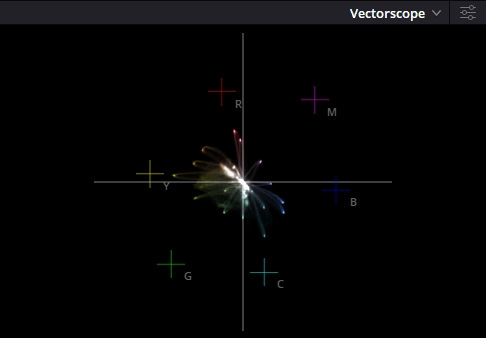
In previous examples I've shown dorect comparison between stepts, but now let's see what happens to the colors by checking the vectoscope as we apply our settings.
Sony Classic Chrome vs Fuji Classic Chrome
Vectorscope Comparison
By lowering the Kelvin, we are making the colors cooler. This means that the blues and magentas look more realistic, and the greens turn towards teal. And this is exactly what we want.
Sony Classic Chrome Picture Profile with AWB vs 3800K (no color filter)


However, lowering the Kelvin also makes the reds, magentas and yellows cooler, which means red becomes pink, and yellow become slightly green. We don’t want that, so we'll use the color filter settings to bring back some warmth and shift the colors in the direction we want them to be.
The color filter setting lets us add a color cast to our image. We can choose from amber, green, magenta, or blue. We want to use amber, which is a color situated between yellow and orange. By adding amber, we can balance out the reds and the yellows, shifting them towards orange, balancing out all the colors, making them look natural.
Sony Classic Chrome with 3800Kelvin - Color Filter A7


When we add amber to the image, we make the image warmer and the reds more orange. This gives us more natural and earthy skin tones. The reds are still too pink, but the other colors are more balanced.
Now let's see how Standard Sony Colors compare to the Sony Classic Chrome film simulation on the Vectorscope!
Sony Standard Color AWB vs Sony Classic Chrome at 3900K A7


With the Sony Classic Chrome recipe colors are more accurate to real life.
Greens and blues are shifted towards cyan, reds are shifted back into place, instead of being pink-ish they are almost perfectly accurate, magentas are straight where they should be and the yellows are suffering a bit, it would help to shift them more towards Orange by pushing the color filter at A7-M0.5 or A7-M1, but that would again push all the colors into the magenta side, so I need to settle here.
You can also fine-tune the color filter by adding a little bit of green or magenta, depending on your preference and your camera model. Sony cameras have different color science, so they might look slightly different from model to model.
For example, my Sony a7III has more magenta cast than my RX100 VI, so I use different settings to match them. On my a7III, I use 3800K A7-G0.5, and on my RX100 VI, I use 3800K A7.
With these Sony film simulation settings, you only need to adjust the tint a bit and you can match your different Sony cameras with your Fuji cameras. This will make your workflow easier and smoother.
Let's check the results against the Fuji:
We went from this:
Sony Standard Color AWB vs Fuji Classic Chrome AWB
Shot on RX100 VI vs Fuji X-S10


To this:
Sony Classic Chrome 3900K A7 vs Fuji Classic Chrome
Shot on RX100 VI vs Fuji X-S10
Of course there will be some differences, but it's crazy how similar they are without having to color grade! And my questions is, would you notice the differences if this wasn't a straight 1:1 comparison?
On Sony the reds are still slightly pink, and the yellows are more realistic, while Fuji shifts them towards amber. But they are very close, and that’s without any editing or post-processing.
More than replicating Fuji's colors, Sony Film Simulations are about getting great color straight out of camera, and even creating your own signature look without the need of post processing. And while I've accurately recreated many Fujifilm recipes, Sony's Picture Profile menu allows for creating even more complex film simulations. So, don’t feel limited to Fujifilm colors—embrace the opportunity to create your own unique look with your Sony cameras!
Wanna share your Sony film simulation JPEGs or ask any questions? Join the forum!
Stop Compromising When Choosing Your Digital Camera
And there you have it. The Fujifilm vs Sony rundown. What are your thoughts on this? Do the Sony Film Simulations match Fuji's colors?
I've put a lot of work and passion into making these recipes, and it was not an easy task at all. For the past 2 years I had to experiment back n forth with each film simulation, and tweak them carefully to get as close as possible to Fujifilm. Since we don't have HSl tools inside the camera, I had to come op with new ways of manipulating colors to match them in-camera. This makes this project even more complicated that creating Presets in lgihtroom or Capture One where we are spoiled with complex tools to shift colors.
Knowing that, it’s so nice knowing we can match two different camera brands so closely together only by using sony's picture profile menu. And it’s even more amazing that we are talking about Sony here. Many people criticize Sony’s colors, but maybe we just need to learn more about our cameras, to see Sony colors are actually not as bad as people see them. Of course newwer Sony cameras have an improved color science, which makes it even easier to match it to the Fuji, but even older cameras can take advatage of these recipes and get amazing colors without spending hours color correcting.
It would be great if Sony could add some film grain options and simple hue and saturation adjustments for each color channel, similar to how they handle color depth in the Picture Profile menu. This would allow us to fine-tune these recipes and achieve even better colors straight out of the camera. This would truly make Sony cameras limitless!
Try out these Sony film simulations and stop compromising on autofocus, quality, specs, or color when choosing your digital camera.