Sony's New FL1, FL2 & FL3 Compared - Color Differences & Samples
- Veres Deni Alex
- Mar 6
- 8 min read


The original FL1 has been available on cameras released since 2024, including the Sony A7 IV, A7S III, A7C, FX3, FX30, A7C II, A7CR, and A6700, alongside other interesting Creative Looks like SH and IN. But with the release of the new FX2, RX1 RIII, and Sony a7V, Sony introduced two brand-new Film Looks: FL2 and FL3.
(Note: Sony has also recently released firmware updates for the A1 II and A9 III, officially bringing FL2 and FL3 to those cameras as well!)
If you’re curious, like I was, to dive into the differences of FL2 vs FL3, let’s explore them together. I asked Sony to send me the FX2 to test these profiles extensively, and they were kind enough to also include the new 50-150mm F2, which is an incredible lens and a lot of fun to use!
In this article, I’ll go over the main characteristics of each Film Look, explore how they behave under different color temperatures to understand exactly how the affect colors.
(If you end up loving these profiles and want a complete, ready-to-shoot workflow, check out my 39-Look Sony Creative Film Looks Pack for even more options!)

Table of Contents
FL1 vs FL2 vs FL3: Sony's New Creative Looks Compared

On a dull overcast day the differences are more subtle but Sony’s new Creative Looks each bring a distinctive color science to the table, and they’re all fantastic additions for photographers and filmmakers looking to get a nice looking image without post processing.
FL1: in my eyes, it delivers a classic Kodak-inspired film look: higher contrast, lower saturation, and a warm, slightly greenish tint to the white balance. It’s ideal for anyone chasing that timeless, nostalgic aesthetic.
FL2 introduces a soft, desaturated pinkish tint, making it perfect for portraits or any scenario where you want gentle, classical beauty tones. It flatters skin, smooths harsh color transitions, and adds an elegant pastel mood to your images.
FL3 has the strongest color shift of the trio. To my eye, it resembles Kodachrome slide film, echoing the visual styles found in the work of iconic photographers such as Steve McCurry, David Alan Harvey, Peter Guttman, and Alex Webb, along with several unknown artists whose Kodachrome archives I’ve found & studied. It’s vibrant, bold, and unmistakably cinematic, great for travel, street photography, and scenes filled with rich color.
Real-World Examples: FL1, FL2, and FL3 Settings in Action

All of these recipes are crafted to give each situation a specific look, some more pronounced and others a bit more subtle, designed to a specific mood or purpose.
These specific looks are available inside my complete 39-Look Sony Creative Film Looks Pack. The full pack includes 39 unique film looks, inspired by the most popular simulations from my original Picture Profile pack, now reimagined as Creative Looks for an even easier, faster, and more intuitive workflow.
FL1 – Street - designed for urban shooting, this look delivers high contrast, low saturation, and deep colors. Perfect for gritty street photography, cityscapes, and moments where you want bold shadows and strong atmosphere. It works especially well for silhouette-style street shots, adding mood and intensity to everyday moments.

FL2 – Documentary - With slightly desaturated tones, balanced contrast, and subtle WARM peachy warmth, it creates a natural but film-inspired aesthetic. It’s perfect for storytelling, travel, or documentary-style projects, where the goal is to keep colors grounded in reality while still giving your images a touch of character.

FL2 – Portraits - This look is all about people. With its soft contrast and smooth tonal range, it creates a flattering, timeless look that enhances skin tones naturally. Ideal for weddings, events, or lifestyle portraits, it brings a gentle film-inspired softness that makes every frame feel personal and authentic.

FL3 - Autumn Time - A rich amber-gold film simulation that evokes a dry autumn atmosphere. Perfect for portraits or nostalgic, vintage-inspired creative shots with an iconic look.

Don't have the FL2 and FL3 modes? Check out 15 settings that can get you started with Creative Looks!
A Few Notes
Sony’s color science has improved dramatically in recent years, and the newer Creative Looks such as VV2, SH, IN, FL1, FL2 and FL3 offer distinct film-inspired aesthetics straight out of the camera. This already gives Sony more variety than many competing systems.
Fujifilm is well known for its film simulations. A few of them, including Classic Chrome, Classic Neg and Nostalgic Neg, are genuinely exceptional for their character and filmic rendering. However, many others like Velvia, Provia, Reala Ace and Pro Neg Std behave more like standard profiles you would find on any camera. They are solid, but not particularly unique.
Sony has made major progress, and in many situations its Creative Looks can produce more stylized and visually striking results than Fujifilm, especially if you prefer bold or cinematic colors. On Fujifilm, only 3 simulations feel truly distinctive. On Sony, I can easily select six Creative Looks with unique color palettes and strong shifts.
So, which system has better color, Sony or Fuji?
It depends on the situation. Overall I feel Sony has more interesting color shifts, but Fujifilm still holds an advantage in overall color refinement. Its transitions and contrast handling often feel smoother, and subtle details such as teal-tinted shadows add depth that Sony does not always match. Fujifilm tends to deliver pleasing and balanced tones without harsh saturation spikes or abrupt shifts between shadows and mid tones.
What annoys me about Fuji jpgs, is that no matter what they lack contrast. The engine on my XT-5 always seem to be lifting the shadows compared to the EVF preview for some reason.
Sony’s Creative Looks are impressive, but not perfect. Certain colors, especially oranges, can become oversaturated or clip in high-contrast scenes. Shadows sometimes desaturate too quickly in high contrast situations, which can cause sudden transitions between dark and mid tone areas. This will be noticed in skin tones. In certain ocassions Dynamic Range Optimizer will make skintones pale yellow, which is not flattering. With better control of saturation and smoother tonal transitions, Sony could achieve some of the best out-of-camera color on the market. But right now there is still some work to be brought to the creative looks.
Or even better, offer us a color matrix as in cinema cameras or jpeg baked in luts so we can get exactly the colors we want without any hassle.
These color limitations don’t affect Sony’s Picture Profiles as much, since they offer smoother tonal gradients and, in many cases, far more flexibility than Fujifilm’s film simulations once you learn the menu. I’ve created a large collection of film simulations using these profiles, which you can find in my shop if you are interested.
One more thing to note about Sony Creative Looks: the fade option is cool in concept, but the increments are far too strong. The jump from level 1 to 2 is already huge, and anything above 3 becomes practically unusable if you ask me. Since the scale goes all the way up to 8, the higher levels just turn the entire image into a flat grey. It would be much more useful if the fade steps were more subtle and gradual.
Even with a few remaining quirks, it is clear that Sony has been listening to its users. The new Creative Looks, especially the recently added FL2 and FL3, provide rich, film-like color that stands out, and together with the SH, IN, FL1 Creative Looks, Sony now offers one of the most versatile and compelling sets of out-of-camera color options available today.
Analyzing Sony's FL1, FL2, and FL3 Across the Kelvin Range
When building film simulations with Creative Looks or Picture Profiles, it’s essential to understand how each profile reacts to different color temperatures. Why?
Because every profile interprets color differently across the temperature range. By testing them at both ends of the Kelvin scale, we can identify their core characteristics and predict how color will shift. This allows us to anticipate how the simulation will behave in any lighting situation.
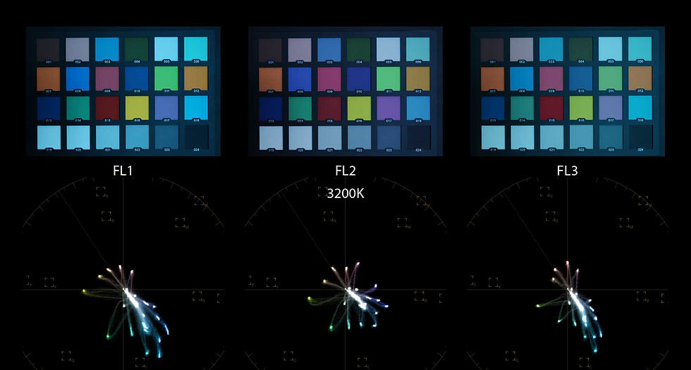
The 5500K Baseline (Neutral Temperature)

At 5500K, each Creative Look reaches a neutral point, giving us the perfect baseline to see exactly how it interprets and shifts colors:
FL1: Shifts the color balance heavily toward a teal-orange scheme. It desaturates magentas, greens, and yellows to create a complementary color harmony focused on red and cyan. Reds are strongly shifted toward orange, and blues shift strongly toward teal/cyan.
FL2: Offers a more natural approach to colors, with balanced saturation and overall pleasant, subdued tones. A cooler magenta tint in the white balance affects most colors: shifting reds toward magenta, blues toward violet, greens toward cyan, and yellows toward a soft pinkish tone. The overall result is balanced and subtly stylized, creating a relaxed, nostalgic look.
FL3: Delivers the most extreme color shifts of the series and is the most creative of the three. Reds are pushed strongly toward orange, blues toward cyan, and greens and yellows are desaturated, creating a bold teal-and-orange look. Overly dominant oranges and cyan-shifted blues can be balanced by slightly increasing magenta in the color filter. Care is needed when using FL3, as its pronounced color shifts can quickly dominate an image.
Now let’s look at how each profile behaves at different Kelvin settings. This helps us understand how the colors shift in various lighting conditions, and what kinds of results we can expect when pushing the temperature warmer or cooler.
Colder Temperatures (2500–3500K)

FL1 and FL3: Both show a strong teal shift in the blues with high saturation, with the blues almost clipping in extreme cases.
FL2: Displays a natural, even color balance, with a slight magenta shift and subtle, slightly desaturated overall saturation.
Warmer Temperatures (7500–9900K)
At higher color temperatures, the main characteristics of each Creative Look remain consistent.


FL1: Retains its orange–teal harmony, with a noticeable green tint.
FL2: Continues to show a magenta-shifted white balance, with colors drifting toward magenta and pink even at these extreme temperatures when normally color should be closer to amber tinted.
FL3: Focuses on the orange–teal harmony, producing strong orange skin tones, desaturated greens, and teal skies. Its white balance is slightly pinkish and more balanced compared to FL1, which leans toward a predominantly green tint.
Conclusion
Sony’s new Creative Looks, particularly SH, IN, FL1, FL2 and FL3, demonstrate just how far the brand has come in offering out-of-camera film-inspired color options. From the subtle, natural tones of FL2 to the bold, striking shifts of FL3, these profiles give photographers and videographers a versatile toolkit for achieving a variety of moods and styles straight from the camera.
Understanding how each Creative Look behaves across different Kelvin temperatures is key to using them effectively. By experimenting with these profiles, you can find the perfect balance between artistic expression and faithful color reproduction, whether you’re shooting portraits, landscapes, or documentary-style projects.
If you’d like to try these looks yourself, the free pack provides a great starting point, while the full Creative Looks pack unlocks the complete range of possibilities. With these tools, Sony now offers one of the most compelling and flexible sets of film-inspired color options on the market, allowing us to get cinematic, film-like results straight out of camera.


Comments